The Parkway Theater in Baltimore
Thoughts on the Baltimore Arts Website Experience
50 milliseconds.
That's the window research summarized by the Nielsen Norman Group puts on first impressions — the snap aesthetic judgment that decides whether a first-time visitor stays or leaves.
Most arts homepages open with a statement of who the organization is: the mission, the story, the brand. What the organization is doing this week waits below that statement, sometimes one click further in.
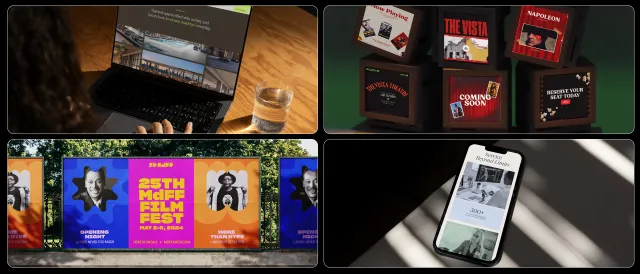
We spent a week with 7 Baltimore arts homepages to see how each one handled that tradeoff. For 3 of them, we drew concepts.
What we looked at
Organizations whose core work is running a calendar: theaters, galleries, multi-use venues, cultural centers. We set aside collection-driven museums and coordinator institutions; different business models ask different questions of a homepage, and mixing them would have muddied the read.
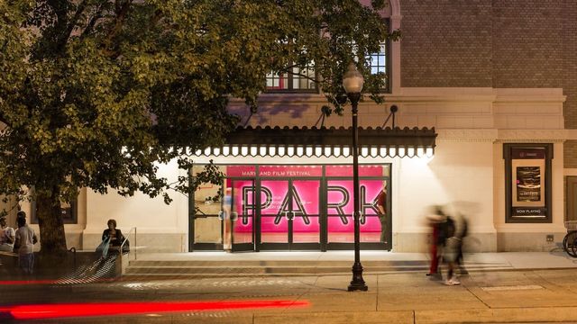
Our recent work includes the SNF Parkway Theatre website and identity, where we designed the first view around what's playing now. The active festival sits in the hero. The weekly program fills the view below it. The membership ask and the institutional copy come after. That order is what kept the question in front of us as we looked at the rest of the set.
The first viewport is where the site and the stranger meet. What fills it is an editorial decision, not a design detail.
2 homepages that lead with programming
Baltimore Center Stage
Baltimore Center Stage fills the hero with its season — a dated artifact that is itself an event. Dated promo tiles follow below. "Plays & Events" is the first nav item. Ticketing lives on a branded domain. The whole site orbits what the organization does each night.
Current Space
Current Space makes the same editorial choice at a smaller scale. Dated event cards sit in the first viewport; the /calendar page hands off to Withfriends for RSVPs. Different resources, same instinct.
1 homepage that leads with a specific program
Maryland Art Place
Maryland Art Place leads with Out of Order 2026 as the hero on desktop and mobile — a specific, dated program. The /events page takes a different shape, closer to a landing hub than a chronological listing, and the two layers don't quite speak the same language yet. The instinct at the top of the funnel is a strong foundation to build on.
4 homepages that lead elsewhere
Baltimore Unity Hall
Baltimore Unity Hall opens with a welcome banner and venue imagery. A click through to "Calendar" lands on a clean, chronological events page with clear CTAs on every listing. The programming is one click in.
Unity Hall is newer to the scene, and the current homepage reads like an early pass at identity work. A later pass could bring the calendar forward.
Le Mondo
Le Mondo opens with a membership pitch, carried in the cutout-collage language that makes Le Mondo feel like Le Mondo. Below the fold: the weekly calendar of theater, music, dance, and film that fills the venue.
We drew a concept that keeps the visual system intact — orange, pink, turquoise, layered shapes, display type — and moves a featured show, a ticket CTA, and the next 3 events into the first view. The membership ask moves below, where it follows the programming rather than precedes it.
View desktop • View mobile • View annotations
Motor House
Motor House opens with a brand film — a well-produced 3-minute YouTube embed. The "Upcoming Events" section lives directly below.
Our concept moves the film to a supporting page and brings upcoming events into the first view. The dark warm palette stays. The logomark stays. The film remains for visitors who want it; it just stops standing between a stranger and the calendar.
View desktop • View mobile • View annotations
Eubie Blake Cultural Center
Eubie Blake opens with a mission statement: "Bringing artists and audiences from diverse backgrounds together." We wondered what would happen if the mission were demonstrated in the first view rather than declared.
Our concept replaces the mission line with 2 pieces of current programming: the exhibition on view now on one side of the hero, the next few events on the other. The mission moves to a supporting role below. Navy and teal stay. The colorful Eubie Blake portrait mark — the strongest visual asset on the site — stays exactly where it is.
View desktop • View mobile • View annotations
The pattern
Across the set, one thing stood out. Homepages that open on programming give a first-time visitor a stronger reason to stay inside the first view. Homepages that open on identity, the mission, the story, the brand, ask that visitor to take the identity on trust before meeting the work.
Neither is wrong. They're different editorial decisions about what earns the first 50 milliseconds. For a calendar-driven organization, where the answer a visitor came for is what's on this week, opening on programming puts that answer closest to the question.
Show the work first. Ask for trust second.
The identity still gets its turn — below the fold, on an About page, inside the design language that carries through every pixel of the site. A visitor who meets the programming first and stays is the visitor who becomes curious about the organization behind it. The order is what changes.
None of this calls for a redesign. In all 3 of our concepts, the visual identity is intact — the palette, the typography, the marks, the texture. What shifts is what the first view is for. It's the same shift we made on the Parkway.
Frequently asked
Our hero video, photograph, or mission statement is central to our brand. Why might we move it?
The question is what the first view is currently asking a visitor to do. A hero that builds identity for an organization most visitors already know earns its placement. A hero that builds identity for an organization most visitors are meeting for the first time is a different calculation, and programming might earn it more. The video and the mission can sit a fold lower without disappearing.
Does this apply outside arts organizations?
The framing, what's happening this week, is arts-specific. The underlying question, what is the first view asking the visitor to do, isn't. Product companies ask it as "is the product visible above the fold." Service companies ask it as "is the value proposition specific enough to evaluate." Same logic, different nouns.
How expensive is a change like this?
Usually a homepage revision, not a redesign. If events are structured cleanly in a CMS, the first view can be rewired in a week or 2. If events live as manually maintained images, the content model comes first. In most cases, the gap between current and ideal is closer to a week of work than a quarter.
In closing
Baltimore's arts organizations do real work each week to make programming happen — curating, producing, community-building. Most of that work sits behind the homepage.
The homepage is where it first meets a stranger.
The strongest ones show what the organization is doing. The rest follows from there.
If you work at one of these organizations, or one like it in another city, or you read the set differently than we did — tell us.
Share: