Here & Away
2026
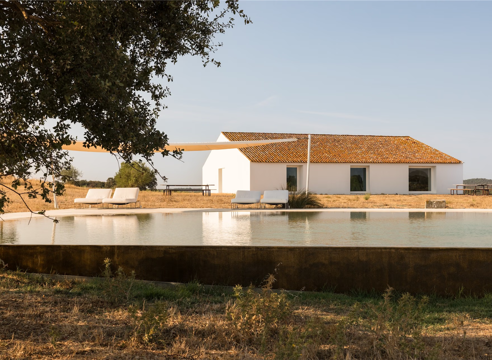
Here & Away brings together hand-selected properties from the desert to the coastline. The new brand takes its cues from those places. The site was designed to be browsed the way you read a travel magazine, with discovery first and booking waiting its turn.In collaboration with Andrea Jelic.
Visit WebsiteAwwwardsBehanceInstagramLinkedIn
Brand strategyPositioningVoice & messagingBrand identityWebsite designWebsite development
A travel website that reads like A magazine and books like a platform.
The Challenge
Here & Away has spent years hand selecting properties worth the journey, and that care shows in every photograph and every description. The brand around it had not kept pace. The messaging never quite landed, the identity sat below the caliber of the stays, and every page had to fit the same Squarespace template. We rebuilt it custom, with an identity drawn from the landscapes the properties sit in and layouts with the range to be editorial.
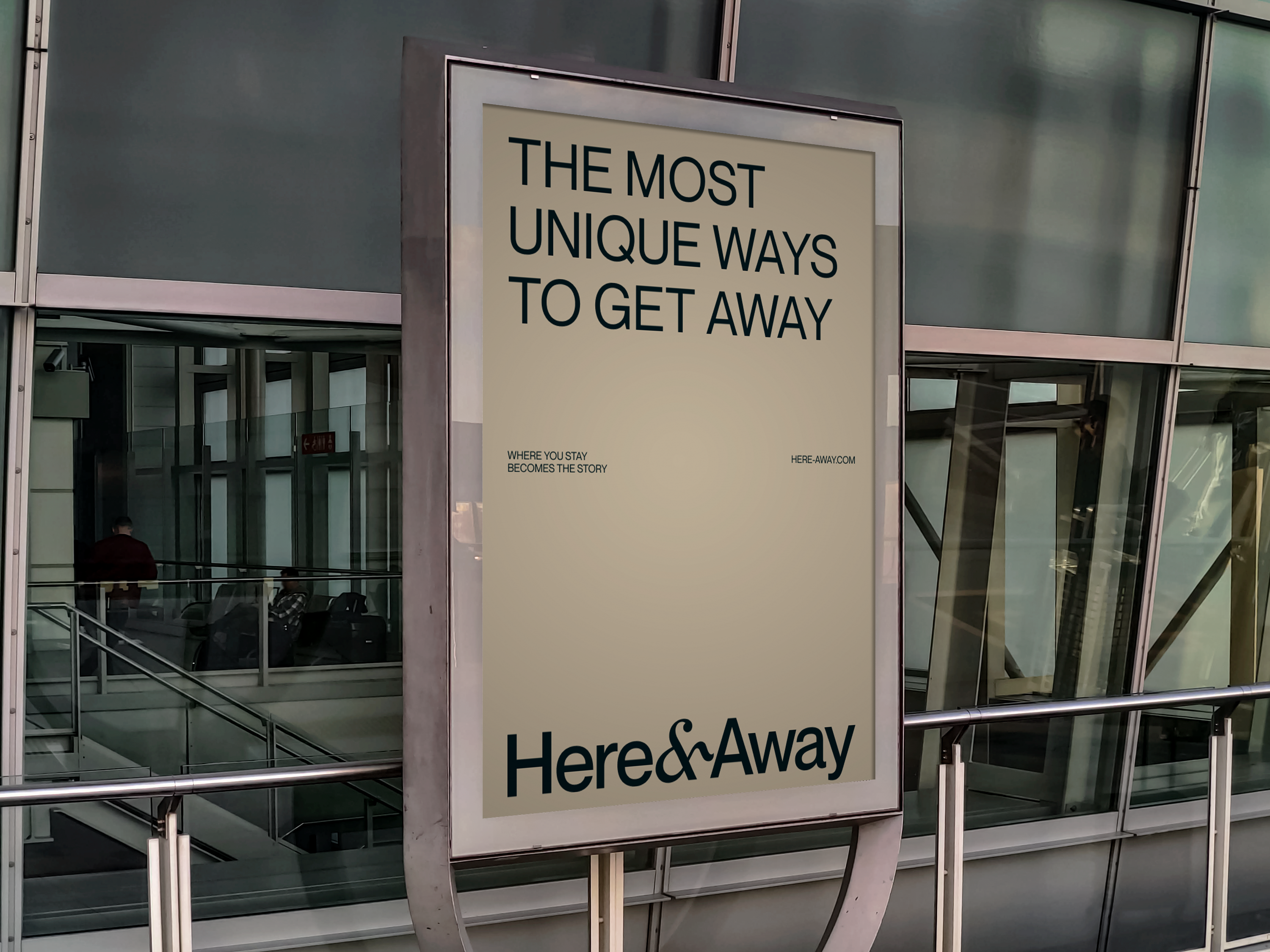
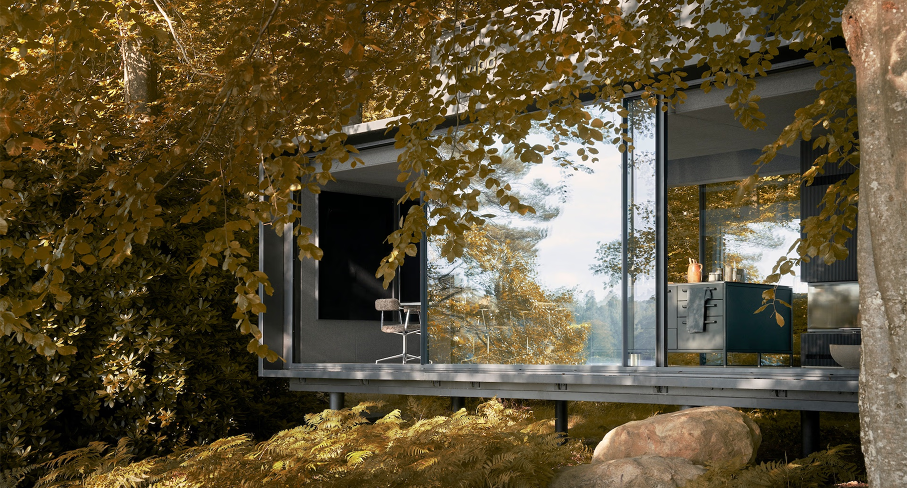
Strategy and Brand Messaging
We began with a series of collaborative workshops to define Here & Away's positioning and audience before any design work started.
Working alongside the team, we identified the travelers the platform serves and the property owners it partners with, developing personas for each and mapping where the brand sits within the wider travel market. From there we built a messaging framework covering positioning, taglines, tone of voice, and sample copy for the places the brand appears most, from property descriptions to host stories and email. The voice is warm and editorial, closer to a travel magazine than a booking site.
Brand Design
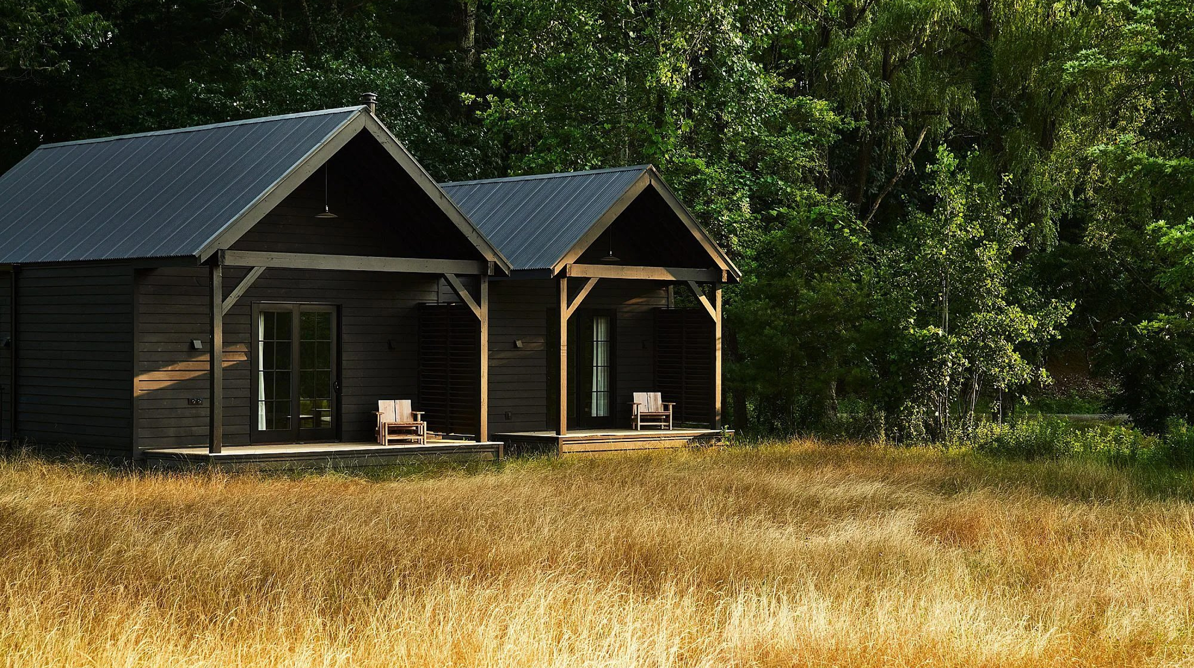
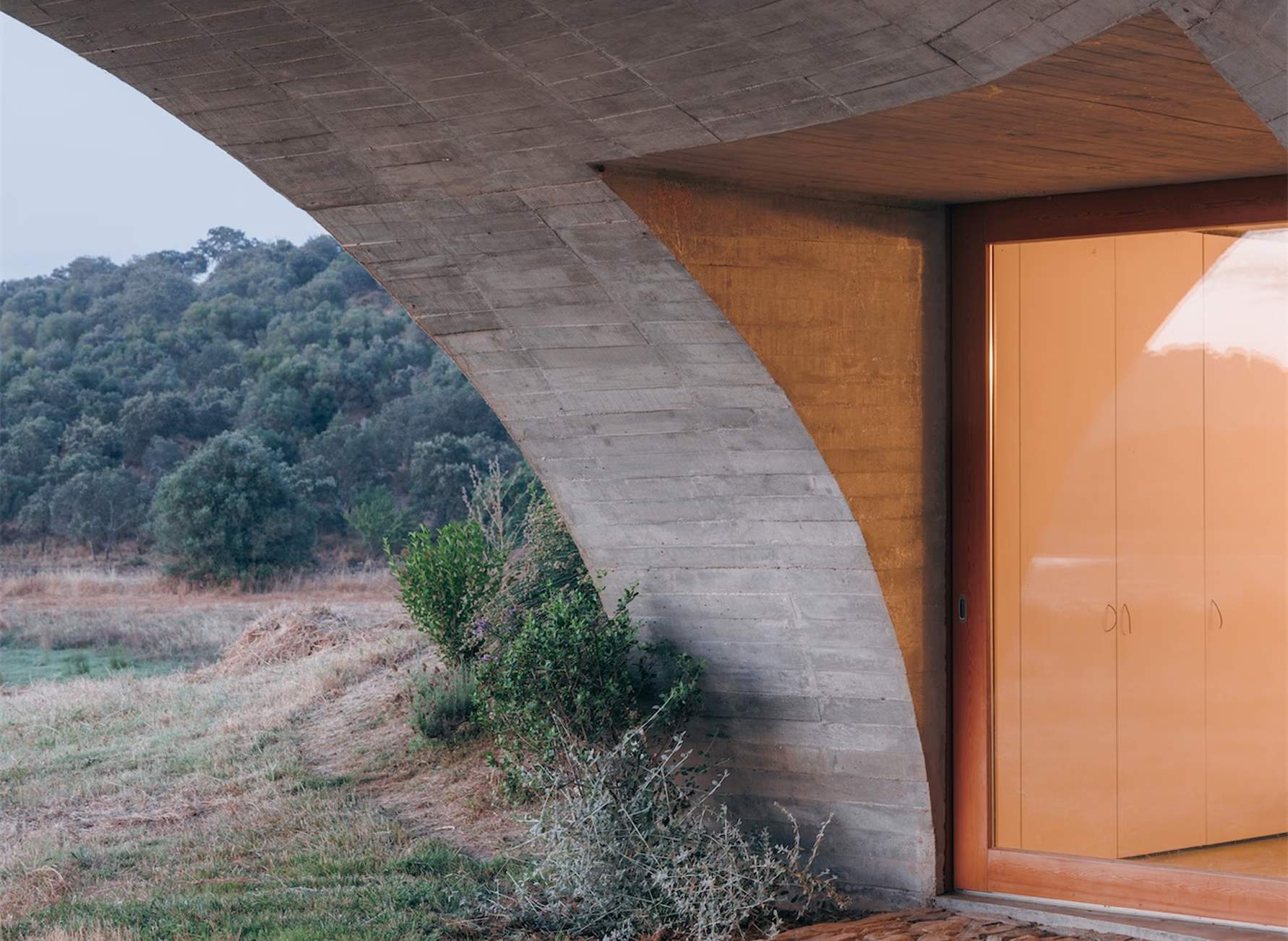
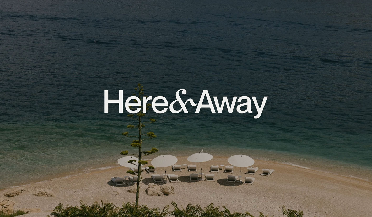
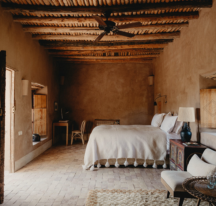
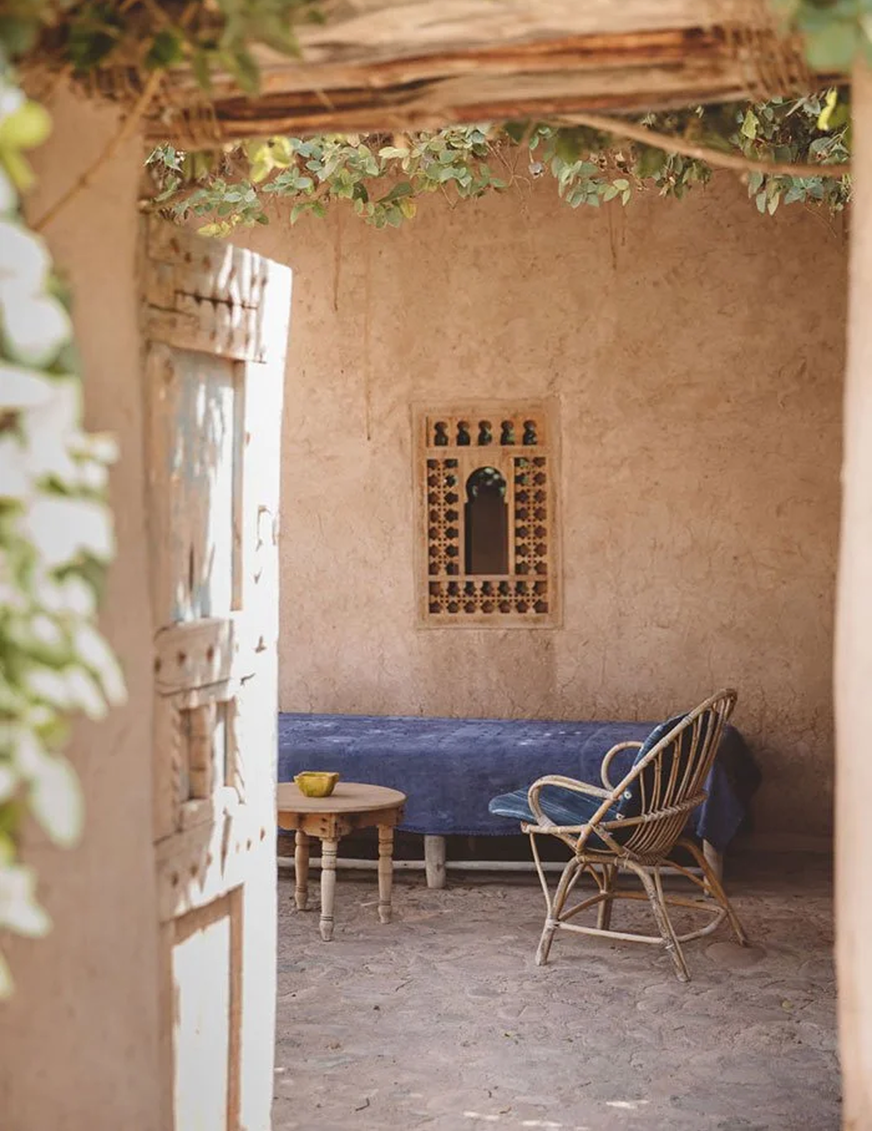
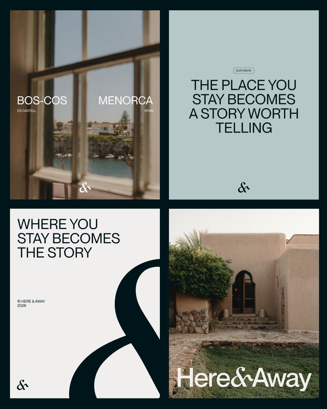
We built Here & Away's identity around the landscapes the properties sit in, using nature as the foundation for the entire visual system.
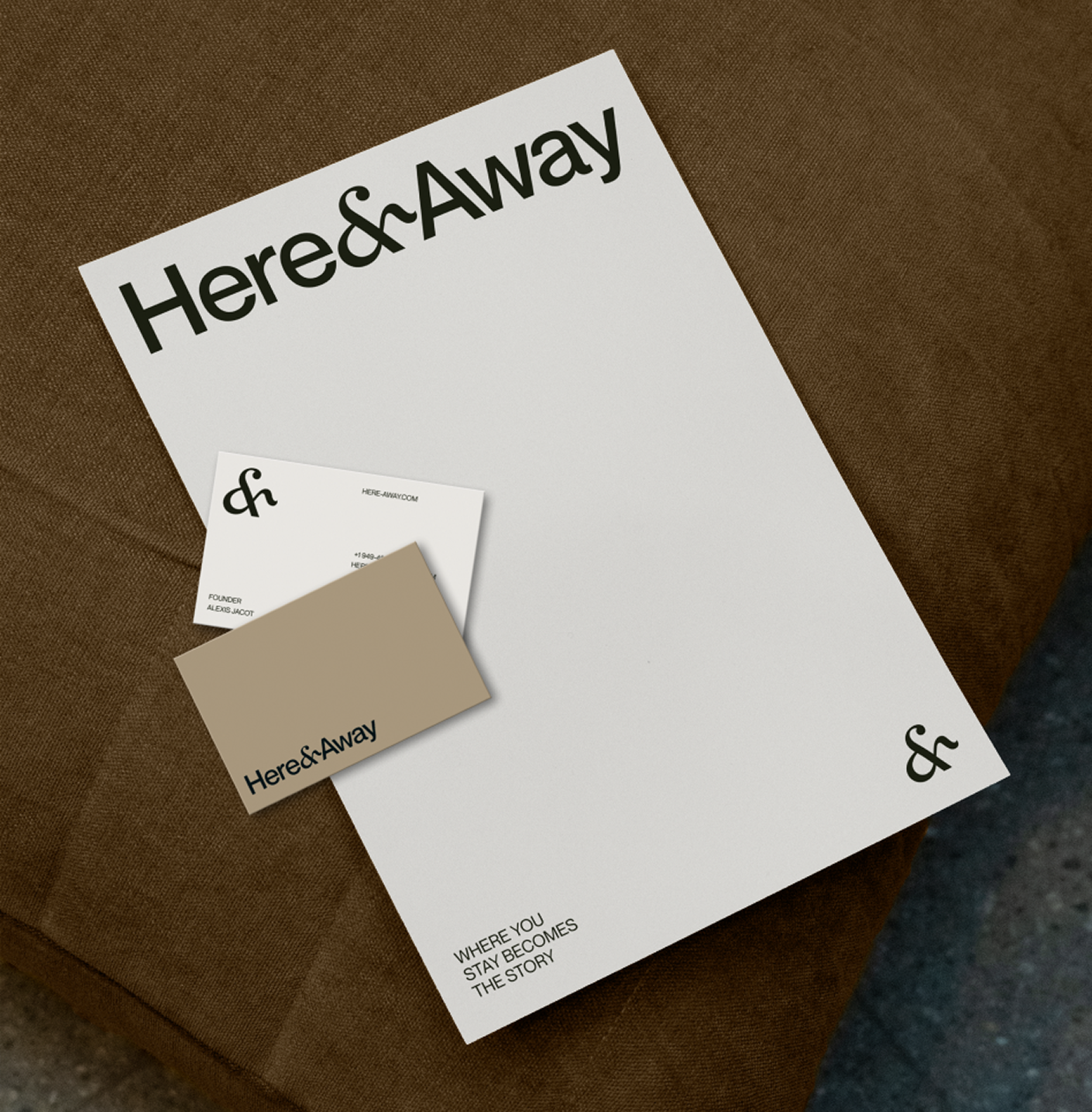
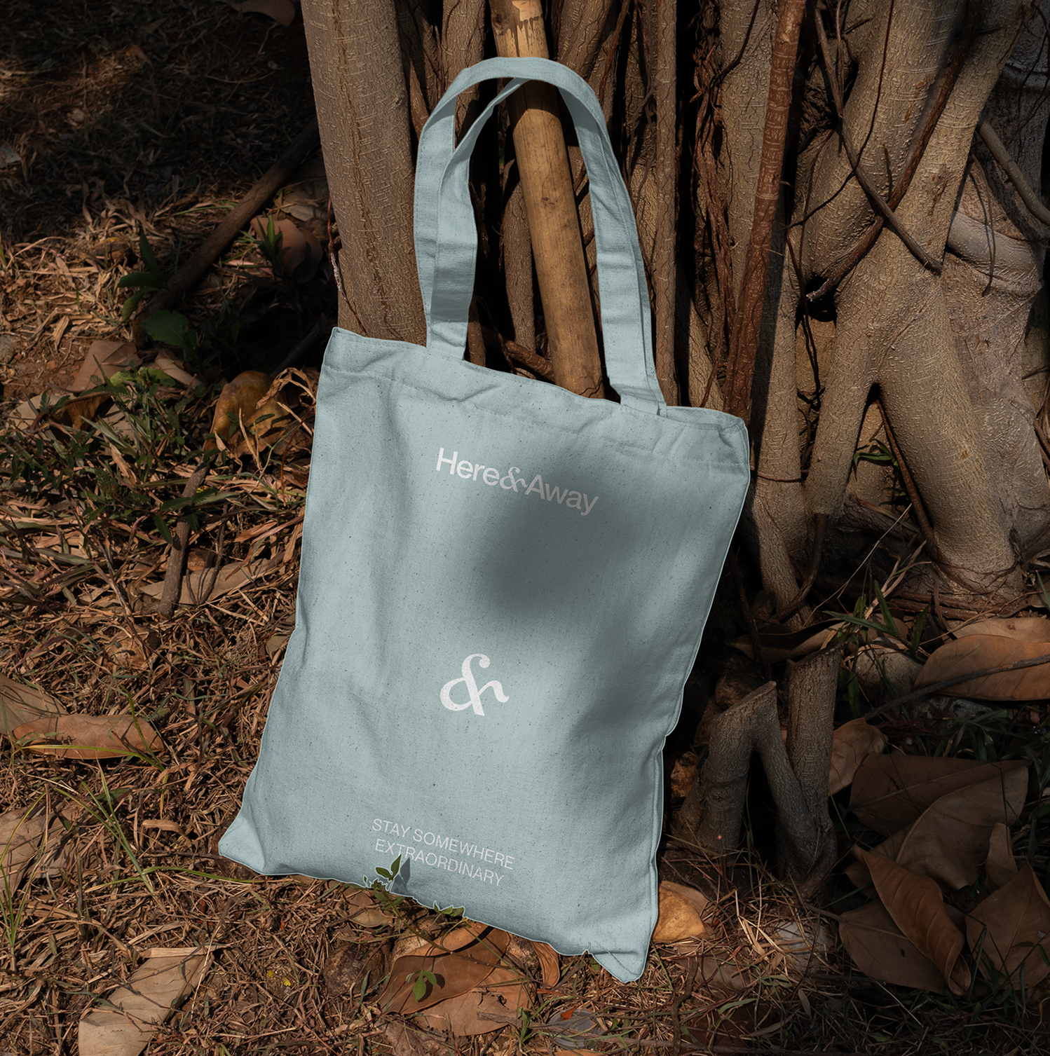
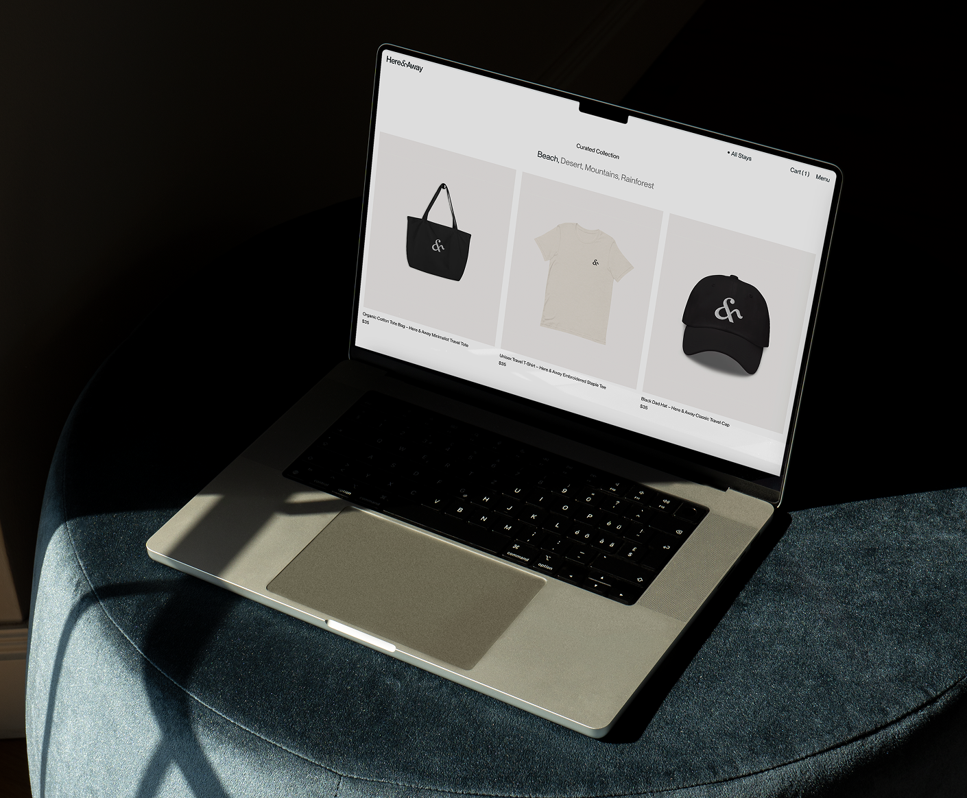
Working across desert, coastline, and mountain settings, we developed a palette of earthy neutrals and natural texture that keeps the brand quiet enough for each property to lead. Large headlines and understated body copy give the photography room to lead. We applied the system across signage, stationery, packaging, and merchandise, building consistency into every place the brand appears.
The system is documented in a full set of brand guidelines covering logo use, color, typography, photography, and layout, which keeps the identity consistent as the collection grows.
Logo Mark
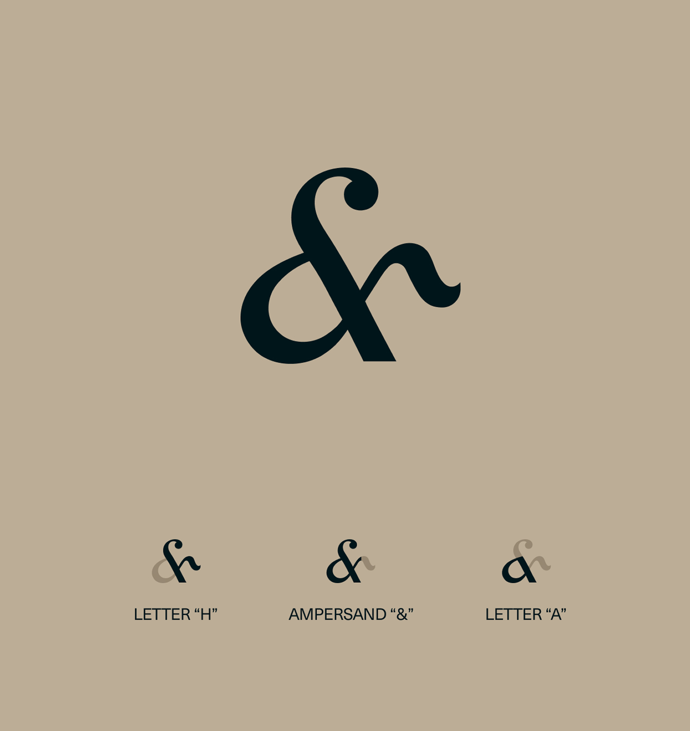
The ampersand sits at the center of the name, which made it the natural place to build the mark. We drew it by hand rather than adapting it from an existing typeface, because it needed to work as both punctuation and a standalone symbol.
The H from Here and the A from Away are built into the same curve, making the ampersand a monogram as well as a character. It carries the brand on its own across signage, packaging, and merchandise, and holds at small sizes where the full logo would be too heavy.
“They took the time to understand our vision and translated it into a website that truly reflects our brand.”
Alexis Jacot,
Founder
Website Design
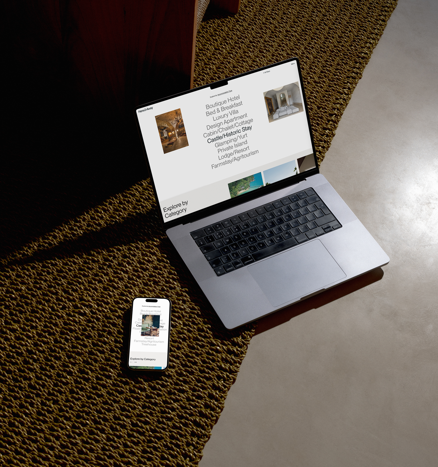
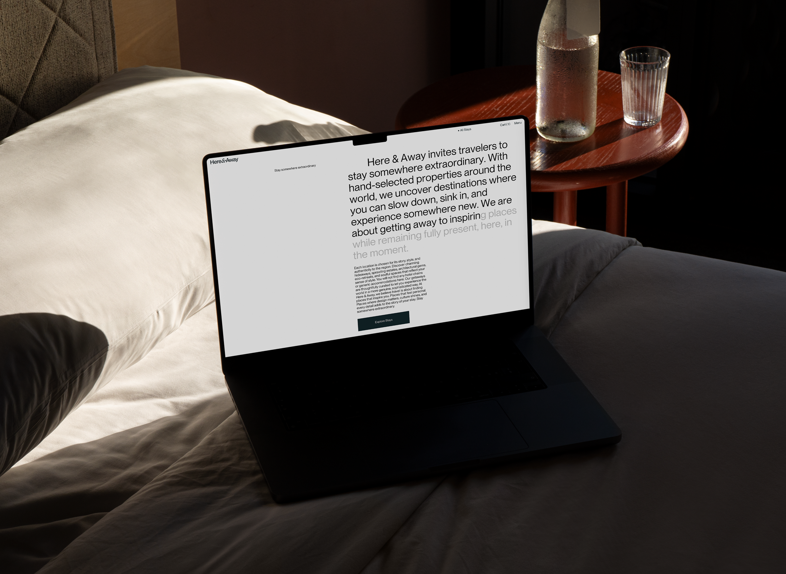
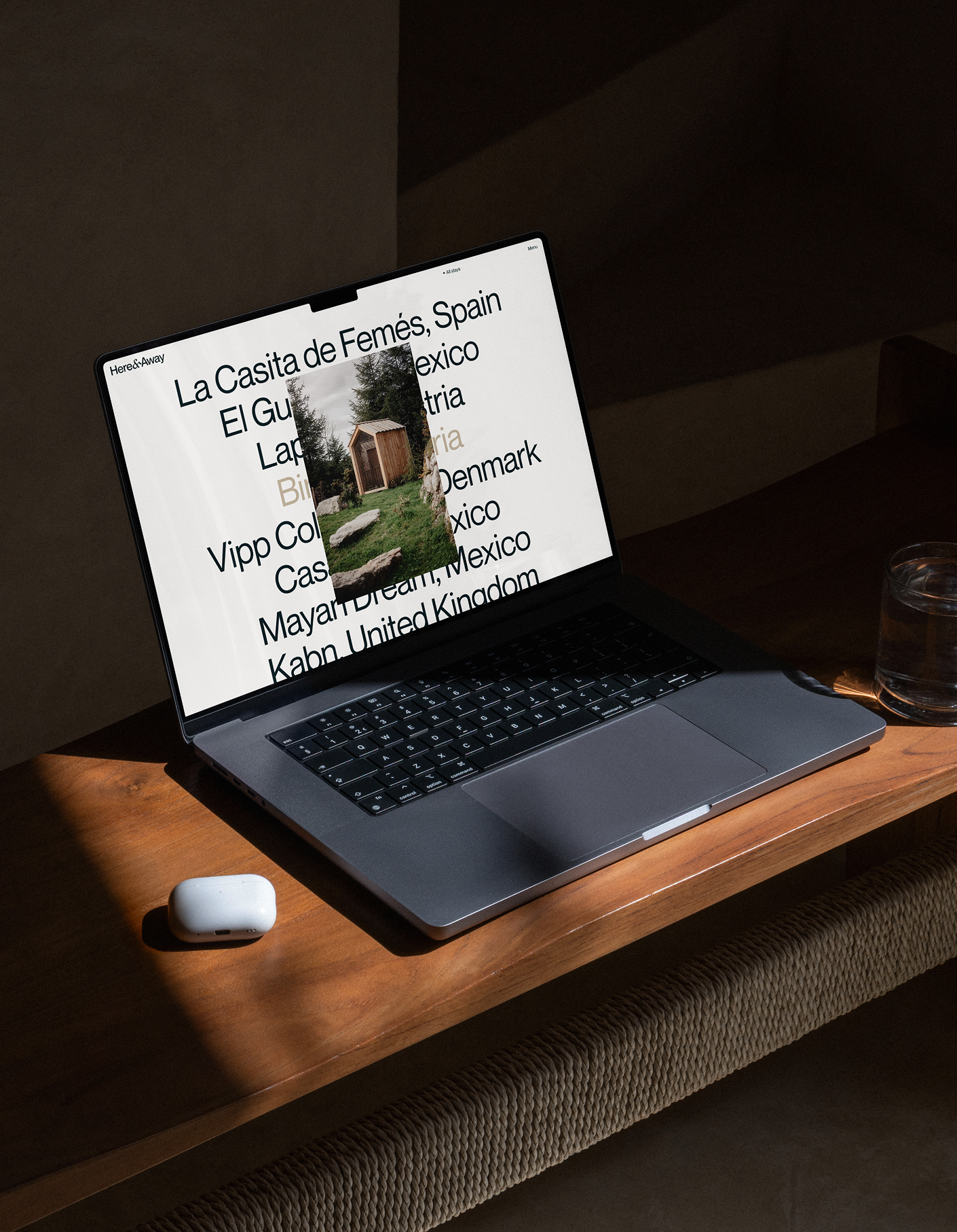
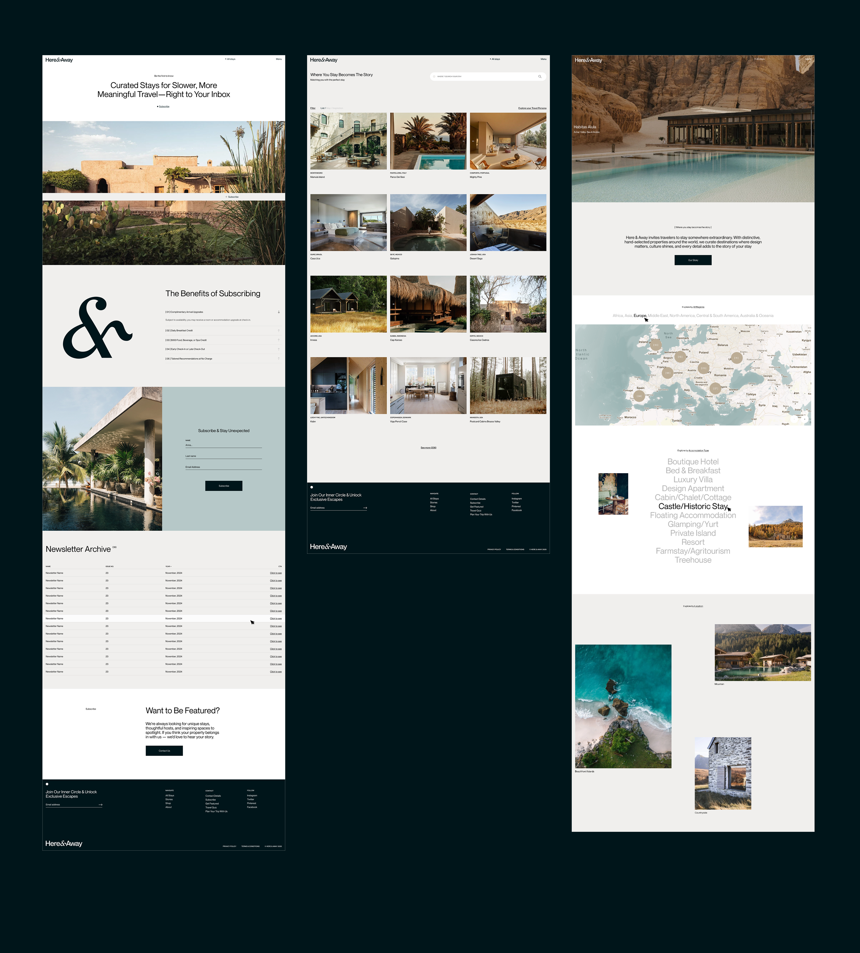
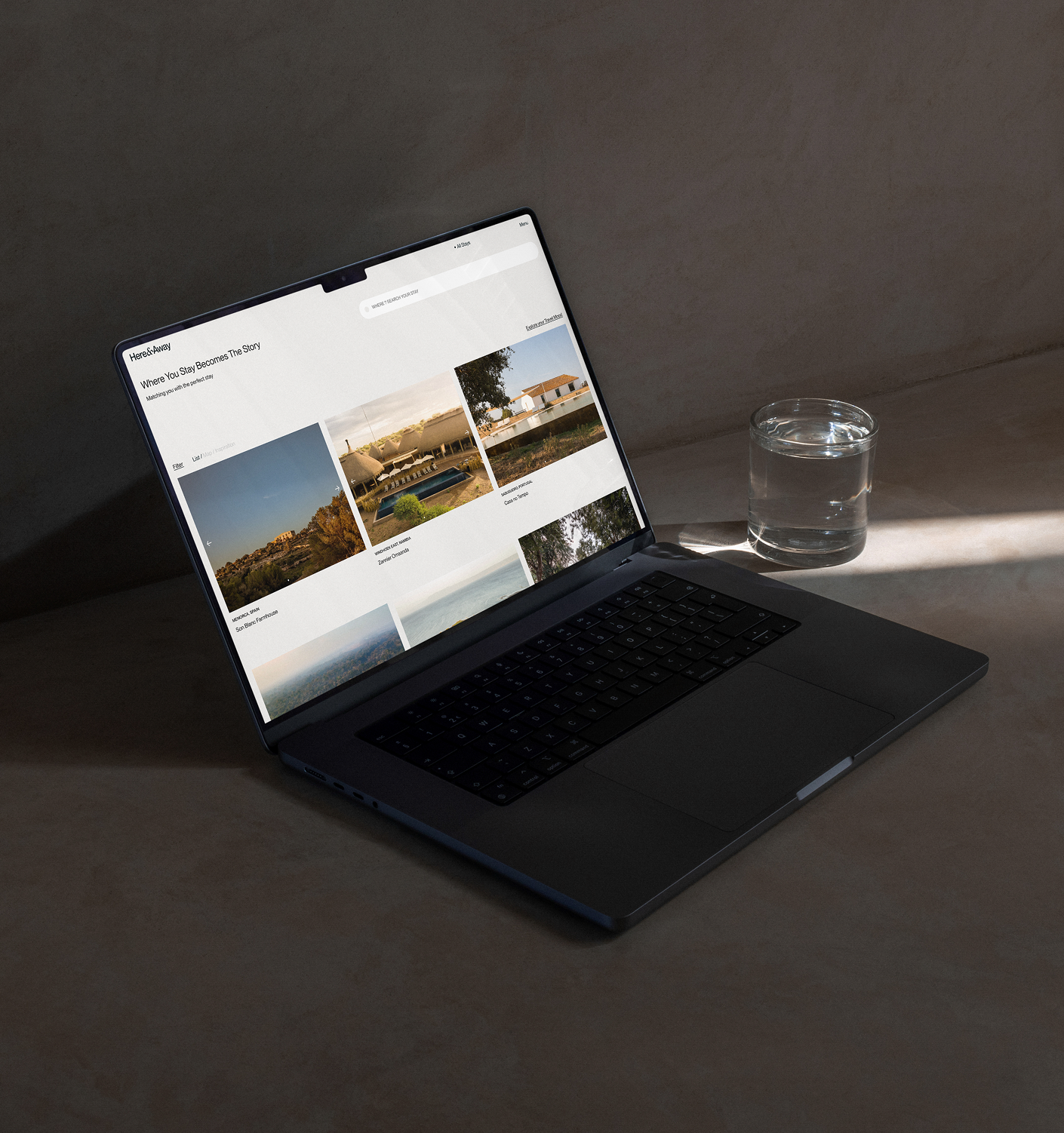
Here & Away needed a site that could hold a growing collection of properties without reducing them to listings. We designed the experience around browsing, with photography leading every page and each stay given the space of an editorial feature.
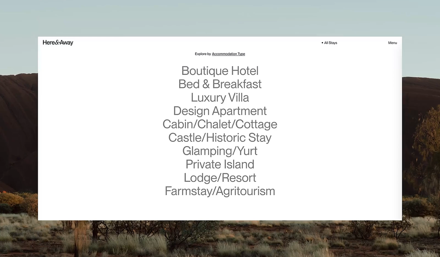
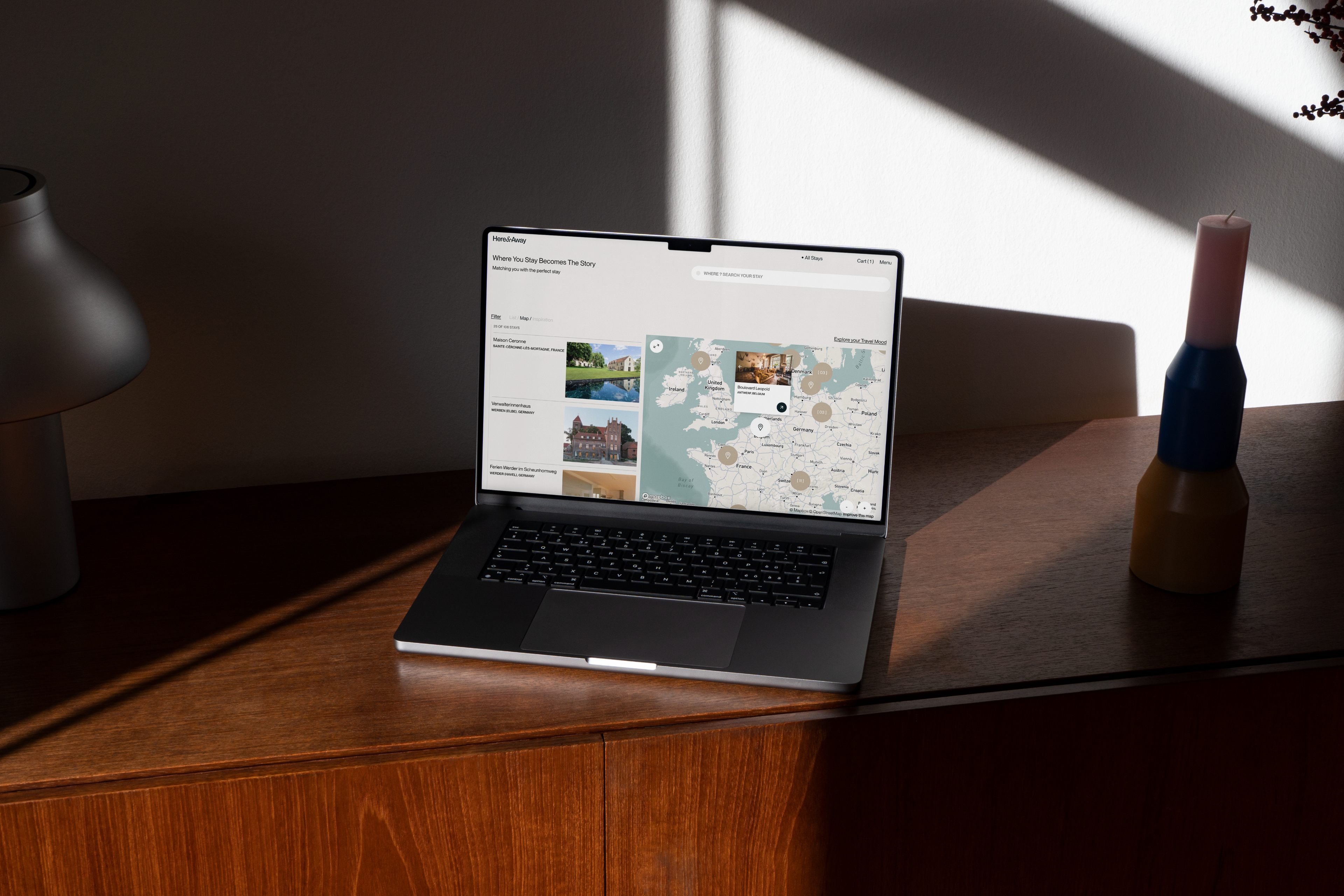
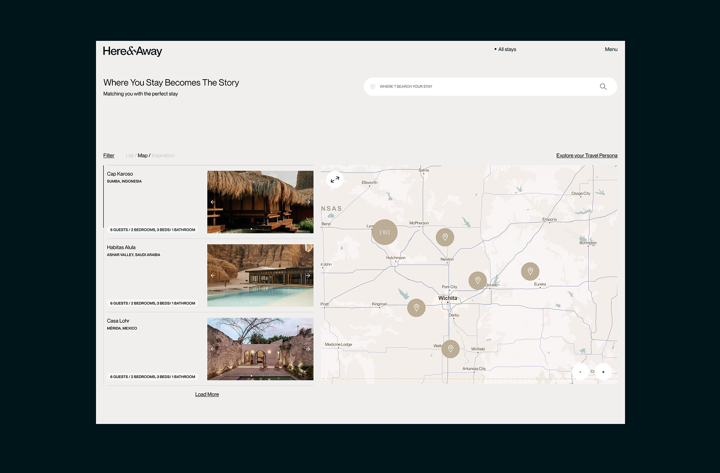
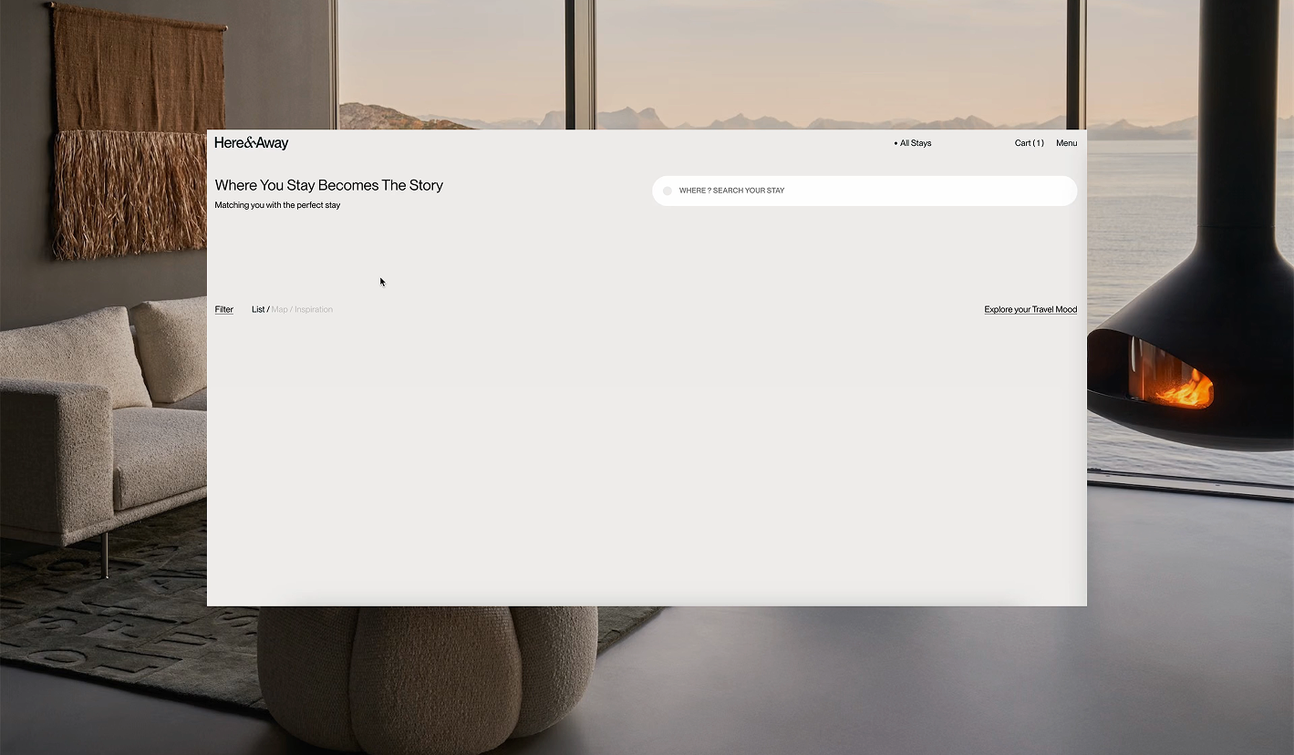
Layouts were built at full scale with generous white space, and each section is composed differently so long scrolls read like a print magazine rather than a repeating template. We kept the interface minimal, introducing color only where it supports the photography. The collection can be explored as a grid, on a map, or through an inspiration view, and we built deep filtering across region, location type, accommodation type, design style, guest policy, and travel theme, allowing visitors to narrow the collection by the kind of trip they want rather than by dates alone.

“The team was creative, thoughtful, responsive, and a pleasure to work with throughout the entire process.”
Alexis Jacot,
Founder
Website Development & E-Commerce
Behind the browsing experience is a custom content system. Each filter also has its own page, giving visitors another way to explore the collection.
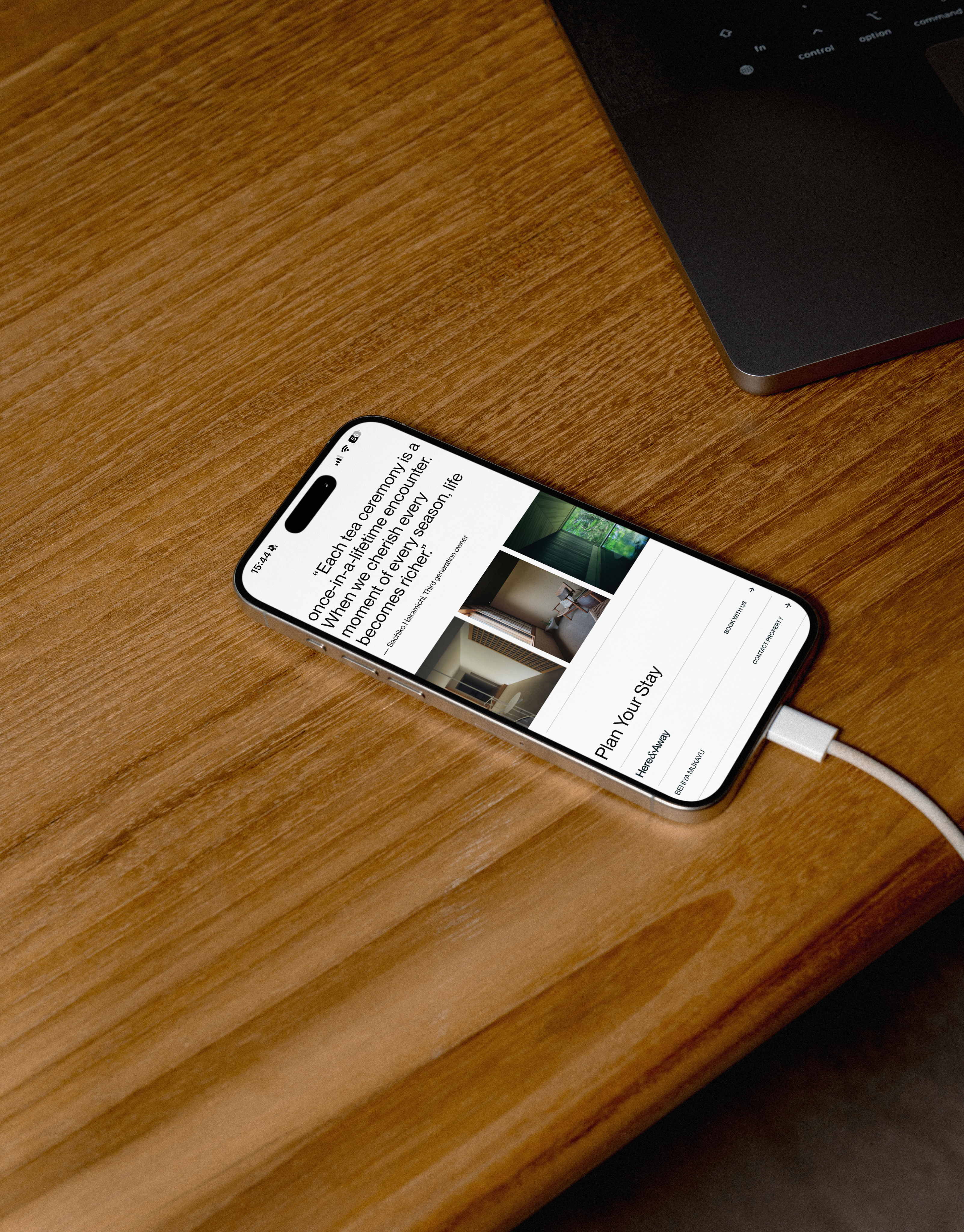
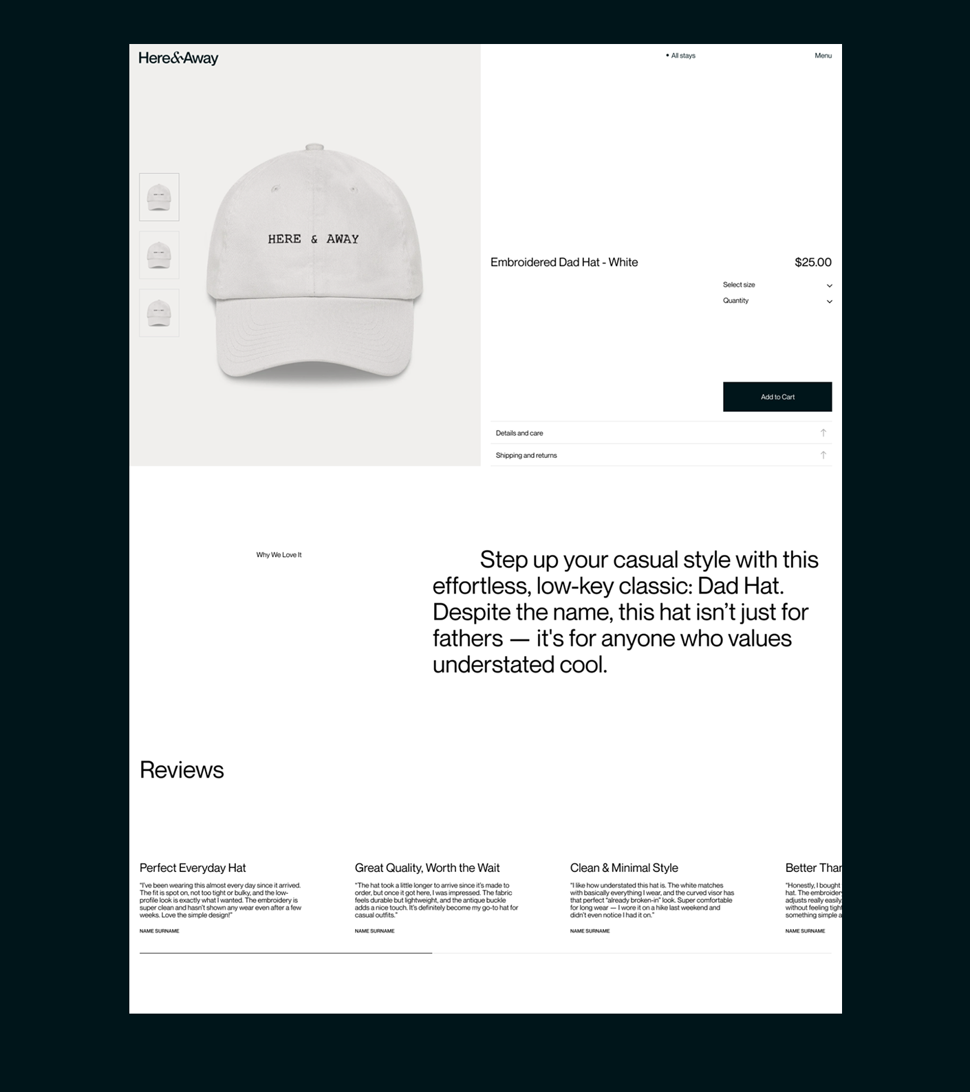
Guests can move between list, map, and inspiration views without losing their place, and a five-question travel mood quiz opens a second route in for people who know how they want to feel before they know where they want to go. Commerce sits alongside the editorial rather than behind a separate door, selling the Here & Away collection next to design books, travel essentials, and minimalist tech, with the cart reachable from any page.
The team can add stays, publish stories and update existing pages themselves, using the layouts and content tools built into the site.
See More